Phonic Friends
An ed-tech, learning kit designed to help children with auditory dyslexia engage with reading through a blend of interactive tools, including a smart pen, book, and app.

How might we support children aged 5-7 with auditory dyslexia better process and distinguish sounds?
♦ Collaborated with a cognitive psychologist to conduct user research and gain deeper insights into education and learning
♦ Developed smart animations to enhance the user experience of the digital app
♦ Created the physical model of our smart pen
6 year old Jacob is struggling to keep up with his reading and writing. He has auditory dyslexia meaning he has difficulty processing sounds.
.png)
We began by exploring various social issues, and eventually our team pinpointed education as a critical issue for Generation Alpha.


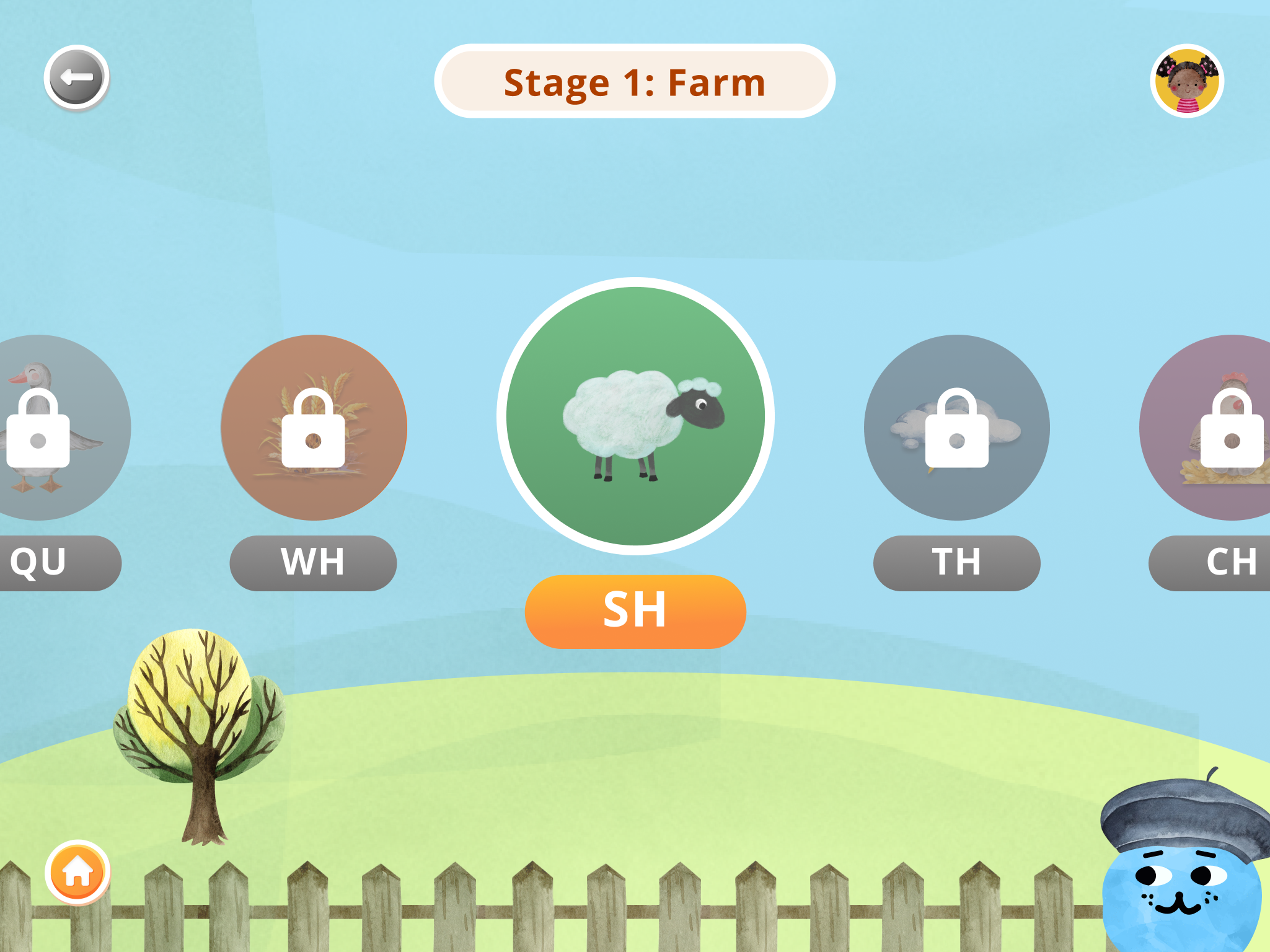
Based on our research, we identified Structured Synthetic Phonics (SSP) as the most effective method to teach children how to read. SSP is broken up into 6 stages with each state focusing on a specific set of phonemic sounds.


Arthur conducted three teacher interviews. His findings revealed that many educators lack essential resources to support neurodivergent students.
"Many teachers lack the necessary resources when it comes to supporting students with disabilities.”
- Anonymous Teacher at Los Angeles Unified School District


I conducted the interview and combed through psychological research papers. My key findings were:
1. Movement and Learning: Numerous studies have established a strong connection between physical movement and improved memory retention.
3. Repetition and Memory: Studies have shown that repetition plays a crucial role in enhancing memory and learning for children.
3. Auditory Stimuli and Cognitive Performance: Background music adds to cognitive load, especially when it competes with the primary task for attention.


We looked at a variety of digital and physical educational products to help us design Phonic Friends. We were inspired by Square Panda, Duolingo, Khan Academy Kids, Leap frog, and Osmos.


After many design iterations, we landed on creating a smart pen, an interactive book, and tablet application. After learning that neuro-divergent children learn best with a blend of visual, tactile and auditory learning experiences, we decided to incorporate this into our overall user-experience.
We wanted to make a clear distinction between the book and the app. The book is dedicated for learning and the app is dedicated to testing and review.
Tactile: The book contains a unique texture for each phonemic sound the child will learn.
Auditory: An interactive pen that reads aloud the sounds in the book, along with an app that provides auditory prompts and descriptions.
Visual: We wanted our visuals to be dyslexic friendly and divided into bite sized pieces.

.jpg)
Emotion sketch of the smart pen by Celia, capturing its elegant, brush-like design.

Exploded view of the interactive smart pen outlining all the parts listed in our bill of materials.

Hero shot of the smart pen highlighting the playful design reminiscent of a paint brush.

Me crafting the 3-D model of the interactive smart pen out of foam core.
The low fidelity physical mockup of the interactive book created by Ryn.

Low-fidelity physical mockup of the interactive book, highlighting a potential interior texture designed by Ryn.

The final prototype of the interactive book and tablet application.

Ryn working on creating the high fidelity physical prototype of the interactive book.
We conducted thorough research to assess the feasibility of manufacturing our physical products. We also looked at the technology necessary for each product. The pen would need to be created through various injection molding techniques and the book through die-cutting, and lamination.


We created a design system to establish a unified and consistent user experience across our three products. Recognizing the importance of maintaining brand coherence and efficiency in design and development processes, we sought to streamline workflows and promote reusability by providing a centralized repository of design assets, buttons, and guidelines.
♦ For our design system, we chose a sans serif font that has larger tracking for improved readability.
♦ Based on research we found, we used left aligned text to make it easier for students to find the start and end of each sentence.
♦ We selected a soft color palette that’s soothing and helps kids focus.


We evaluated our product with with a focus group of six first-grade students with dyslexia. After engaging with the product, all participants expressed a desire to use the tablet and book again!

This project was immensely valuable to me because it pushed our team to envision not only a digital product but also a physical solution that seamlessly addressed a real-world problem. Our biggest challenge was creating a cohesive solution. We spent considerable time crafting a compelling story and and brand for our products and ultimately settled on a painterly theme for both our book and tablet application. Another significant challenge was defining the purpose and boundaries of the book and app. There was a lot of discussion on whether or not the app had more importance or the book. Overall, I believe the project successfully blended the physical and digital realms, resulting in a seamless user experience.